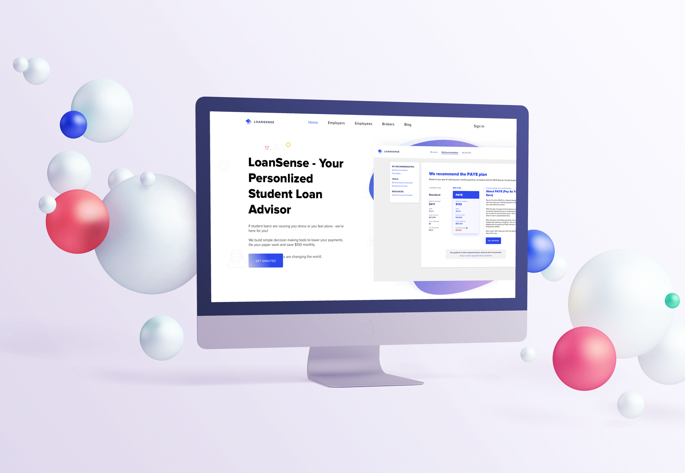
Digital Loan Advisor
A consumer web app that guides users to find the best repayment plan and file paperwork
-
Overview
The digital loan advisor is a consumer web app of a startup, LoanSense. This web app provides a one-stop experience for student loan borrowers to see free repayment advice and tools, file paperwork, and book counseling sessions with financial experts.
In this project, I worked closely with the PM, developers, learning designer and sales team to understand consumers’ needs and iterated on the features based on the data and user feedback.
To comply with my Non-disclosure Agreement, some product features are removed or shown with placeholders in the case study. -
Project Type
Work project at LoanSenseRole
Product DesignerTeam
1 Product Manager, 2 Developers, and 1 Learning Experience DesignerDuration
11 months
(Sep. 2019 - Aug. 2020)Methods
Design sprint, User flow, Rapid prototyping, User testing
BACKGROUND
From enterprise product to consumer product
During my summer internship, I designed LoanSense's MVP
enterprise web app. This enterprise product aims at
serving as companies' employee benefit. After my
internship ended, I continued to work with LoanSense and
helped LoanSense design its consumer web app.
The consumer web app shares most of the
features with the enterprise web app. The different
things between the two include users of the consumer
product could be anyone who visits LoanSense’s website,
and the consumer product has a paywall to differentiate
free and paid services.
PROBLEM
Limited free or low-cost resources to help people set up student loan repayment strategy
According to our previous user research, many federal
student loan borrowers have difficulties understanding
student loans and further exploring different repayment
strategies to lower their loan.
What causes the difficulties include
limited access to information from loan servicers or
the internet
and
the high cost of hiring student loan
consultants. Therefore, LoanSense would like to help loan
borrowers with personalized but affordable guidance.
CHALLENGE
We are new in the market, how to introduce ourselves and attract consumers?
LoanSense aims at providing people affordable financial advising. However, different from the enterprise product that the sales team can have more opportunities to have direct interactions with the potential customers, the consumer product relies more on the first image on the company's website and word of mouth. Therefore, as a new service related to financial decisions in this market, the first step is to build trust with users by creating a user-friendly experience to show our value.
Process
Design Process at a Glance
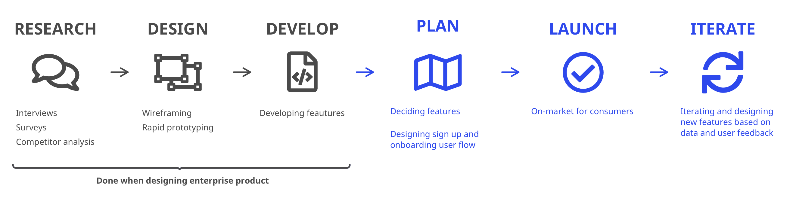
Because the end-users of the enterprise and consumer products are the same, we used the developed features and interfaces and focused on designing the user flow for the V1 consumer web app. Later on, I iterated based on data, user feedback, and business needs.
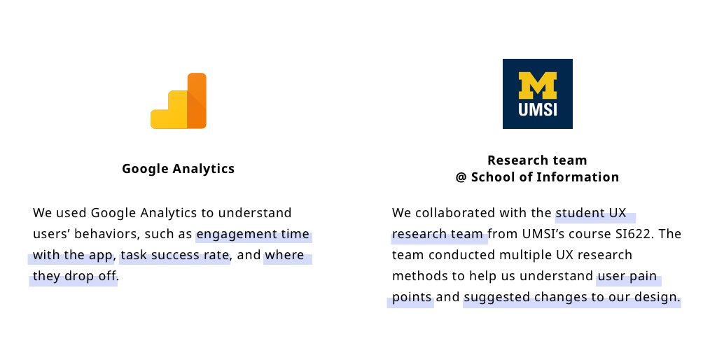
Research
Recap of user research
From LoanSense's previous user research, I understood
the pain points when people deal with their student
loans. The takeaways from the research include:
However, since people's financial and loan situation can be different, I kept understanding the users' needs and behaviors after the product is live.
1.0 Product
Fail early, Learn quickly
Although we finished user tests to validate the design of the key features and user flows when designing the enterprise product, the user scenarios for the consumer product could be more different and complicated that the flows and features might not satisfy the users. Therefore, we decided to launch the consumer product first and keep learning from our users to improve it.
Ideation
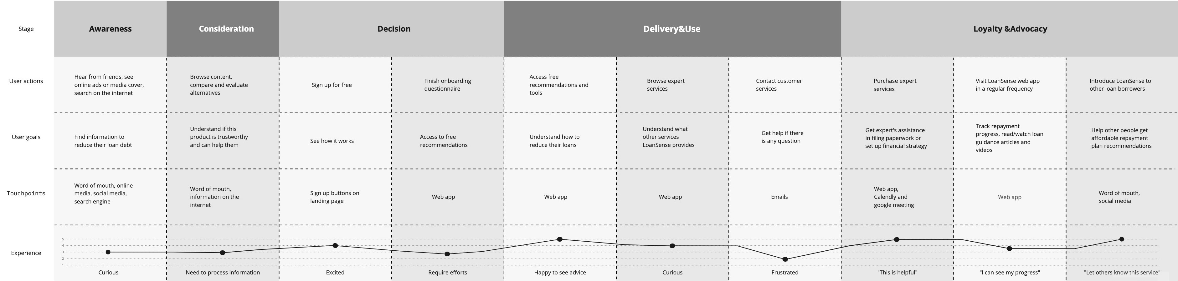
User journey
First, I started from thinking about the entire experience of our users, the student loan borrowers, from landing on LoanSense’s website to using the product. Drawing out the user journey map helped me understand and think about what our users feel and what frustrations and encouragement they might feel during the process.
Categorizing the features
With the developed key features, I started by
categorizing all features and functions.
By
grouping similar functions together, it'll
help users navigate in the web app and find what they
are looking for efficiently. At this step, I also discussed with the PM and
business team to decide what features are only shown
after users purchase extra services.
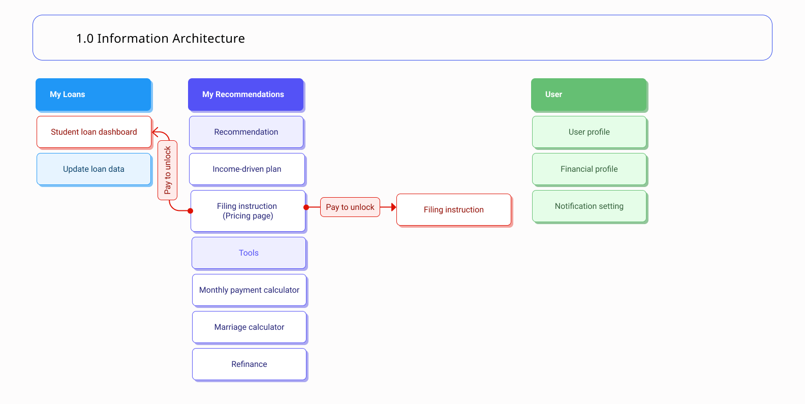
To introduce LoanSense services, I put the repayment recommendations and other tools in front of the paywall. As a new service on the market, LoanSense users may be unsure about the product. Revealing these useful tools can help users understand different ways to help them reduce their loan debt before purchasing any services.
REFINE
Learning from the users to improve the free experience
After designing the first user flow for the consumer web
app, we launched the product and kept improving the user
experience through different research methods. The two
kinds of user information helped me further understand
more users and explore where I can improve to encourage
more users to complete the flows.
The metrics of success for the refining process include:
Build trustworthiness
From our research, we noticed the low task success rate
in finishing questionnaires and filling in the contact
form. Some users mentioned that they were not sure about
giving their information since LoanSense was new on the
market. Therefore I adjusted the user flow to simplify
the sign-up process and provide users with more
information to build trustworthiness.
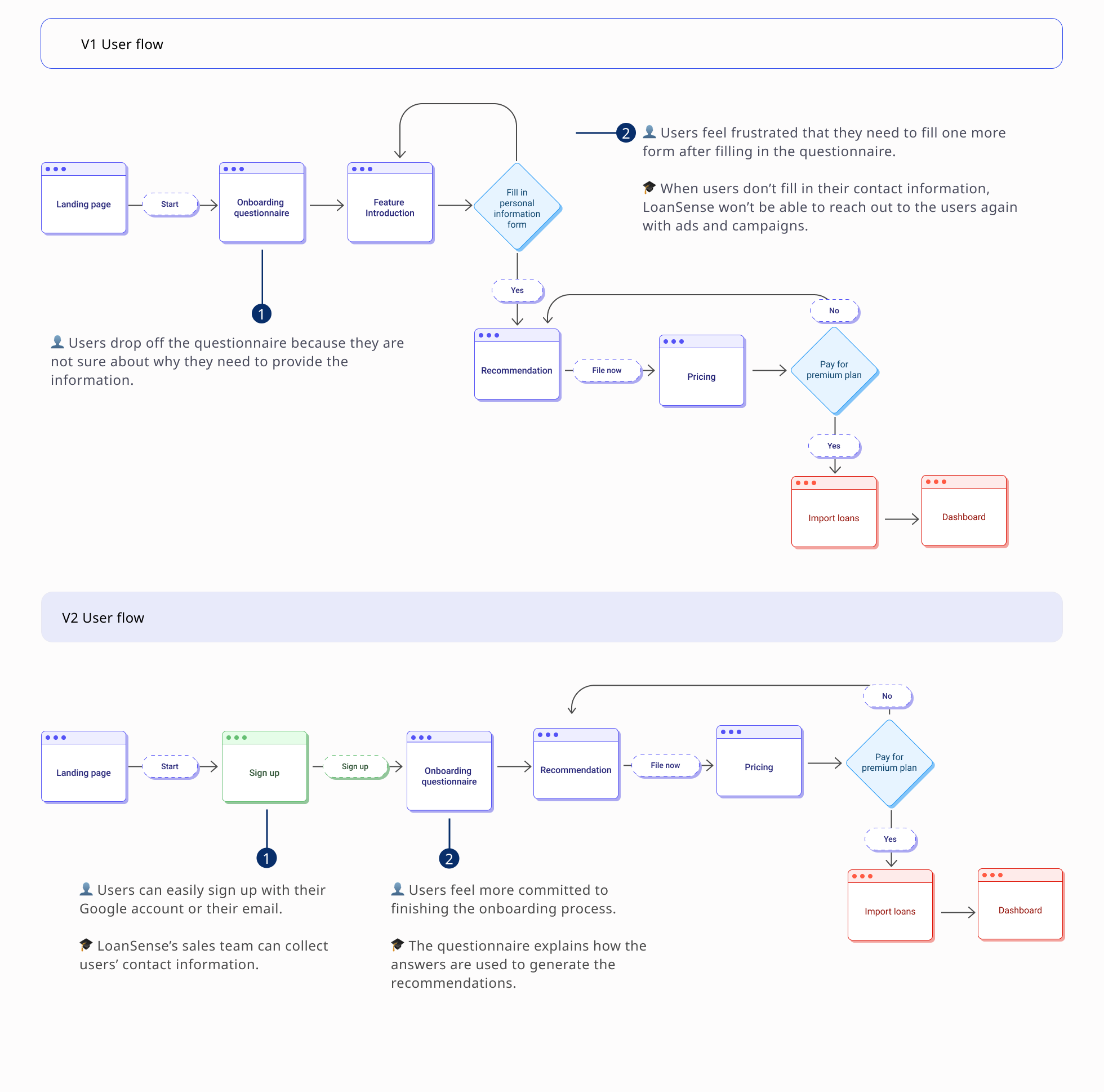
Feedback on V1 userflow
👎🏼 Users are not familiar with LoanSense, and feel
hesitant to give their personal loan and contact
information.
👎🏼 If users drop off from the flow and don’t fill in
their contact information, LoanSense will not be able to
reach out to them again.
Design decision for V2
To Increase the sign-up rate and users’ task success rate in the onboarding process, I:
Shed light on LoanSense’s value
With the changes in V2 user flow, the sign-up and onboarding task success rates increased. However, the conversion rate didn't reach the expectation. Therefore, I suggested the team provide users with names of the recommended repayment plans, and also redesigned the user flow to make the entire experience more smooth.
Feedback on V2 user flow
👍🏼 It's easy to sign in.
👍🏼 Users understand why they need to fill in the
information and feel more comfortable providing it.
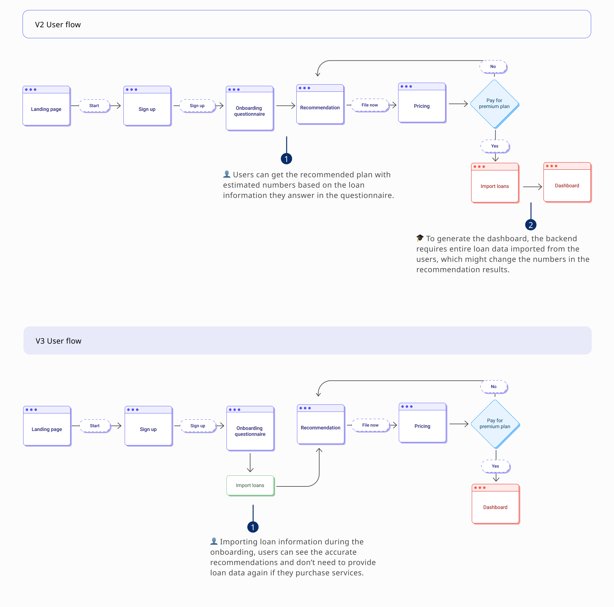
👎🏼 Users don’t know what the recommended plans' names
are.
👎🏼 Users need to give their loan information again after
purchasing.
Design decision for V3
To attract users to purchase the services and simplify the steps after purchasing, I
With the improvement in the user flow, the sign-up and onboarding task success rate increased. More customers visited and used LoanSense services.
2.0 Product
New features to satisfy user needs
With the improvement of the sign-up and onboarding experience, the business grew and was looking to provide the customer with more services. Therefore, I built new features and redesigned the navigation to improve usability and increase the conversion rate.
Ideation
Designing learning experience
To provie our users with financial knowledge, the team
was creating different learning materials to provide
extra guidance for the paid users. Therefore, I worked
with a learning experience designer to design where to
put the informative and educational resources in the
product.
To understand how these resources can effectively help
the paid users, I
did a contextual interview with LoanSense's loan
expert to understand the counseling process and
questions users had. Based on the information, I designed two places for
users to gain financial knowledge.
Prepare for counseling session
Targeting the problem users want to solve in the counseling session, the system can generate related videos and documents we recommended users to watch and prepare.
Learn different topics
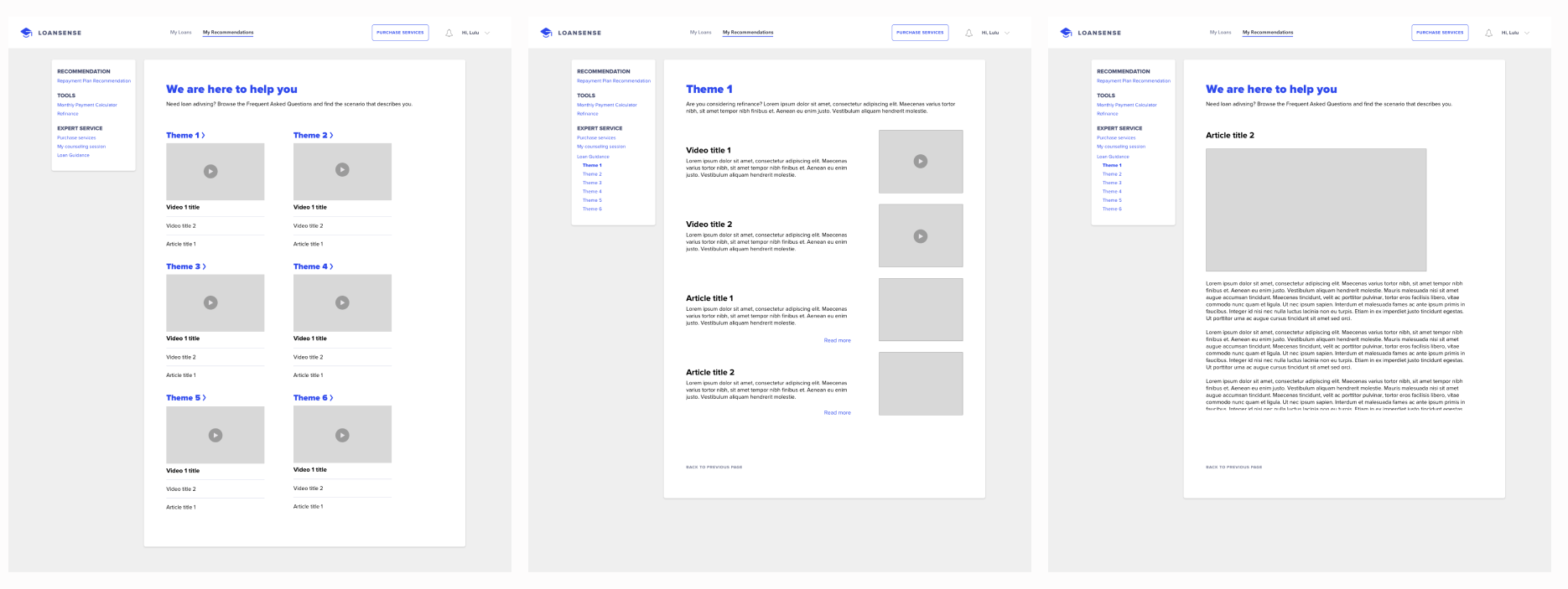
The learning experience designer and I had the loan experts grouped FAQs and insightful financial tips into six topics. With the loan guidance section, the paid users can always come back and learn if they are interested in or having changes in their financial plans.
Why six topics?
To prevent information overload and make it easier to manage the increasing contents in the future, the learning experience designer and I think six topics would be the ideal amount of themes that have enough varieties but also not overwhelming.
Integrating new features
As we added new paid expert services to help users file paperwork or assist users set up financial plans. To integrate the new features to the web app, I added an "Expert service" section under the "My Recommendations" part.
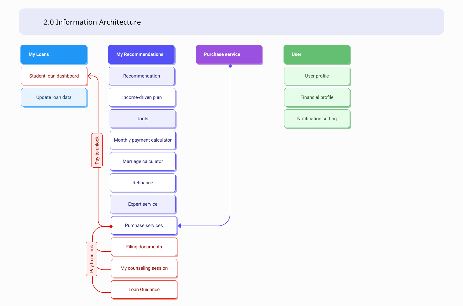
Why did I decide to put expert service under My Recommendations?
My Recommendations is the first page users land on and explore. Putting the expert service in the third section on this page can increase users' interest in learning paid services and evaluate their needs after they browse the free recommendations.
The expert services are all related to making decisions on repayment strategies. It is easier for users to retrieve the expert resources and read other repayment recommendations if information that helps make decisions is on the same tab.
Considering the expert service is hidden under My Recommendations, I added a CTA button “Purchase services” on the navigation bar to enable users quickly to go to the pricing page.
REFINE
Enhancing the paid experience
After designing the new information architecture and features, my next goal was to enhance the conversion rate and improve the paid experience.
Simplifying and clarifying pricing page
My first step was to take over and redesign the design
of the pricing page.
From our research, the users who were interested in the
expert services
couldn’t clearly understand the contents of the
expert services. Therefore, they either
contacted the customer service
to ask for more information, or
gave up purchasing the services.
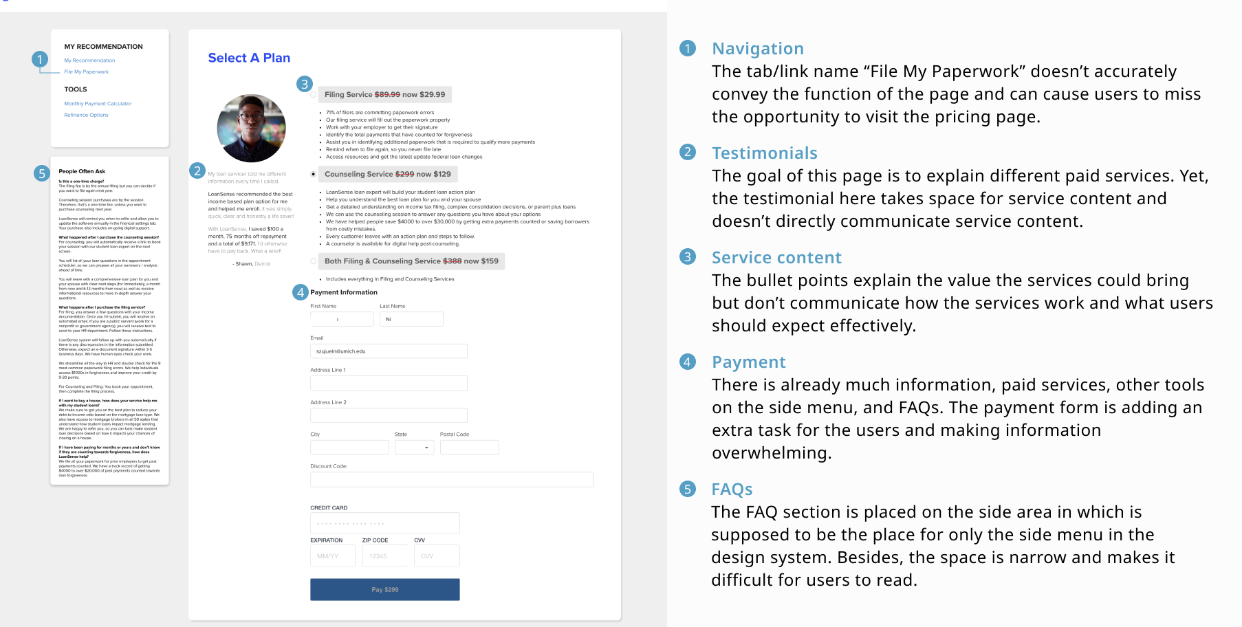
I analyzed the page and conducted some user tests to understand what caused the problems. My solution was to simplify information, rewrite the content, and separate the pricing and payment page.
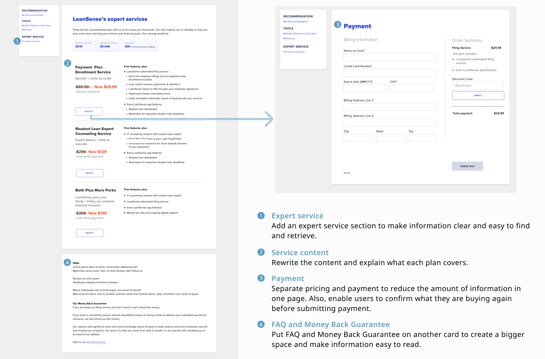
Elevating paid services
Next, after improving the pricing page, I further
thought about what else we could bring to the paid
users, especially for those who purchase counseling
services.
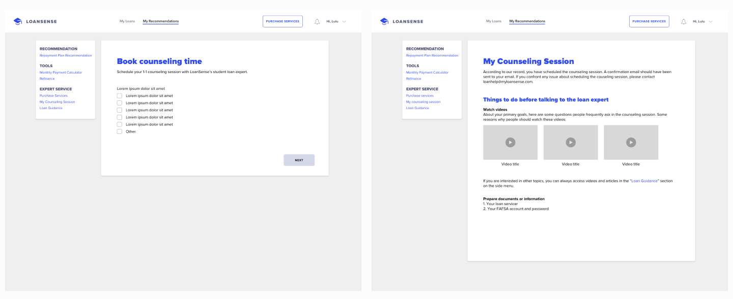
In the original user flow, users needed to get the
Calendly link from their email inbox to book their
counseling sessions. It
led users to leave the web app. What's more, the users
would not access extra guidance or resources before
and after their counseling sessions.
.png)
Therefore, I decided to use the Calendly API that enables users to book sessions in the web app. After the users book the session, they will see instructions for the counseling session and resources targeting their problems. This "My Counseling session" page can help users prepare for their counseling sessions. Besides, they can also access the "Loan guidance" section in which has more articles and videos for common financial topics.
.png)
We implemented the changes, revamping the pricing page, and flow. With the new design, we received positive feedback from our customers and reduced the workload of the customer service team.
FINAL DESIGN
Your Student Loan Repayment Advisor
Personalized repayment plan recommendation
If users have federal student loans and are qualified for other repayment plans, LoanSense tells them which plan is best for them to decrease their loan debt and explain what the impact is with numbers and graphs.
Monthly payment calculator
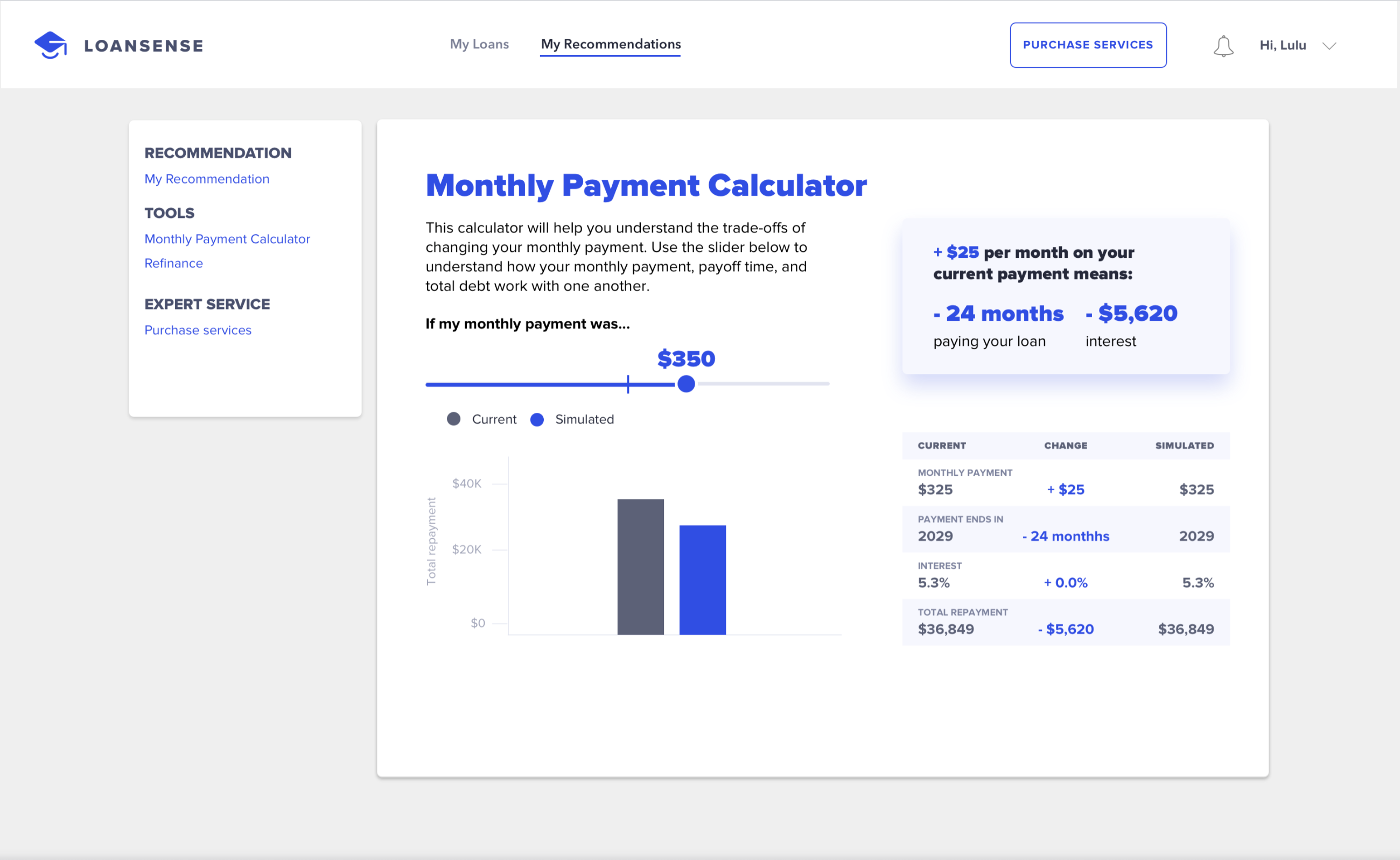
If users are not qualified for better repayment plans or thinking about changing their monthly payment towards their student loans, LoanSense's calculator helps them understand the trade-offs of decreasing or increasing their money that goes to repayment every month.
Student loan dashboard
LoanSense visualizes and simplifies users' loan information to help them track their repayment progress. On the dashboard, users can also learn loan terminologies and customized tips for repaying their loans.
Reflection
What I've learned
Let users speak for the design
During the design process, there were some conflicts between user experience design and business concerns. Facing this situation, I learned to use user research findings to communicate with the team, explain the purpose of my design and further implement the design to create a better user experience and bring impact to the business.