Student Loan Dashboard
A hub of student loan data that helps loan borrowers understand their repayment progress
-
Overview
In summer 2019, I was the sole Product Design Intern at the startup LoanSense. During my three-month internship, I built the company's MVP enterprise web app under the direction of an experienced senior designer who guided me through the design process. I designed two dashboards, one calculator, and seven user flows and handed off them to the engineer team.
To comply with my Non-disclosure Agreement, I can only show you one of my projects - My Loans, a student loan dashboard. It is a hub that contains the users' student loan information and helps users keep track of their repayment progress. -
Company
LoanSenseRole
Product Design InternTeam
1 Senior Product Designer, 1 Product Manager and 2 DevelopersDuration
3 months
(May 2019 - Aug. 2019)Methods
User research, Design sprint, User flow, Wireframing, Rapid prototyping, User testing
BACKGROUND
About LoanSense
LoanSense is a startup that aims at helping people relieve their financial burden by providing customized repayment recommendations. When I joined LoanSense, the company was building its enterprise student loan advising web app. The product can be companies’ employee benefit that enables employers to help their employees access student loan advising and related resources.
PROBLEM
Student loan borrowers find it hard to understand their loans and track their repayment progress
In the US, many students rely on student loans to help
them finish their higher education. It takes the
graduates on the average 10 to 20 years to pay off their
student loan debt.
Given
the complicated repayment plans and financial
jargon, many borrowers find it difficult to set up repaying
strategies. For those who
have several loan servicers, it is even more challenging for them to get a full
picture of their repayment progress because their loan
information is on multiple platforms.
Because of these barriers,
many borrowers don't know that they have
opportunities to lower their debts by enrolling in
better repayment plans or paying loans
strategically.
CHALLENGE
How to make student loan information easy to understand?
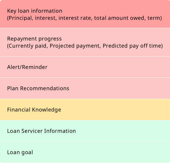
I was assigned to design a dashboard that visualizes and simplifies users’ loan information. Aside from presenting the numbers, my other goal of this project is to motivate users to be active and take action on their repayment plans.
Process
Design Process at a Glance
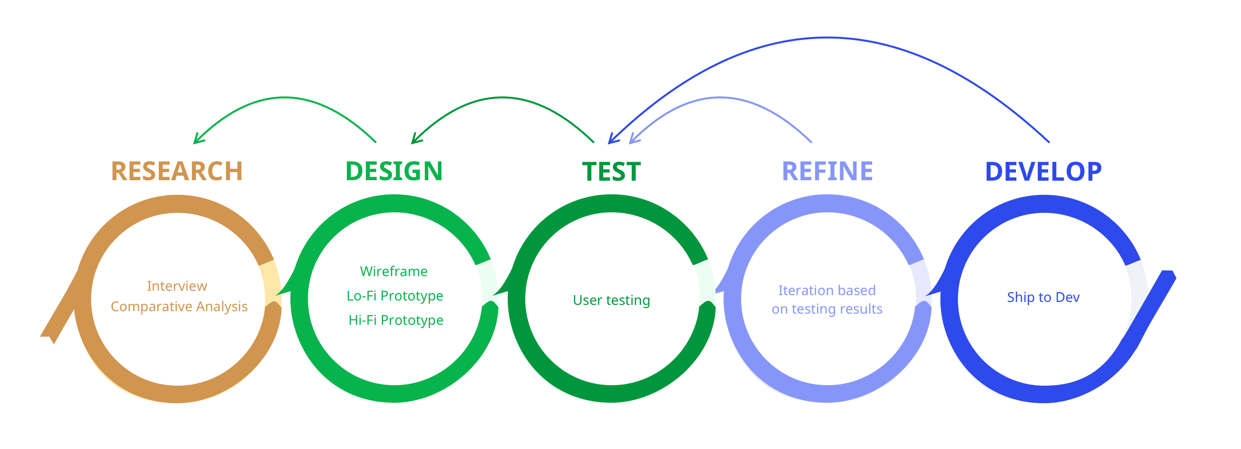
Research
Interviews & Surveys
Before I started the project, LoanSense had done UX
research that collected 200+ survey responses and
interviewed students who have student loan debt. Through
the UX research, I understood the pain points when
people deal with their loans. The takeaways from the
research include:
Ideation
Prioritizing the features from different stakeholders' perspective
Since we were designing for the MVP, it was unlikely to
implement all the solutions that solve our users'
problems at this stage. Yet, we could still
satisfy the majority's needs with limited product
features.
To decide what are the must-haves in the product, the
product manager and I listed the user problems we wish
to solve, and
prioritized them based on the necessity, business
strategy, and the feasibility of development and
management.
The evaluation process helped us focus on the priorities
and further plan for product development in the future.
Initial exploration and wireframing
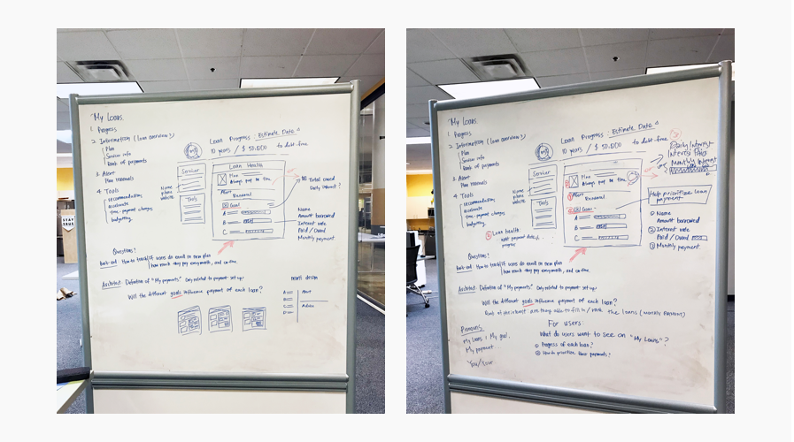
With the information and features we wanted to put on the product, I started brainstorming. I first drew various ways of presentation on the whiteboard and moved to my laptop and with better versions.
Why did't I choose the design?
Why did I choose the design?
You might wonder...
If you were making RWD, why did you start from the desktop version?
Because of some business needs, the team decided to
focus on the desktop version first and make the design
responsive after the desktop version finished. Being
used to making responsive design from mobile to desktop,
it was challenging for me to design oppositely. However,
we made it! Continue reading and you will see how I
iterated the design and make it easier for developing.
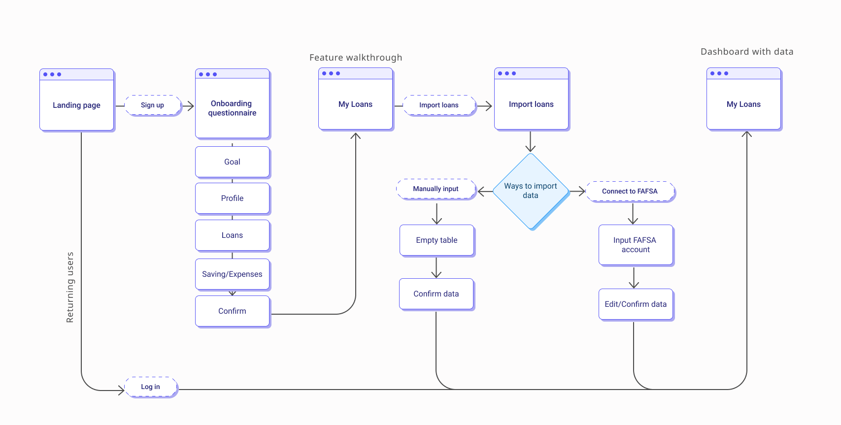
Userflow
While designing the interface, I also worked with the PM and developers to design the user flow so that we can collect the information we need for generating the dashboard and repayment recommendations.
REFINE
3 Designs, 9 User Tests
After deciding the wireframe for my first version
design, I directly moved to hi-fi (or sometimes mid-fi)
prototypes. When designing, I spent most of the time on
how to place users' loan information and walk users
through it.
To validate my design, I conducted user tests with
student loan borrowers. During the user tests, I focused
on seeing
if users can understand the information
and
how long did it take.
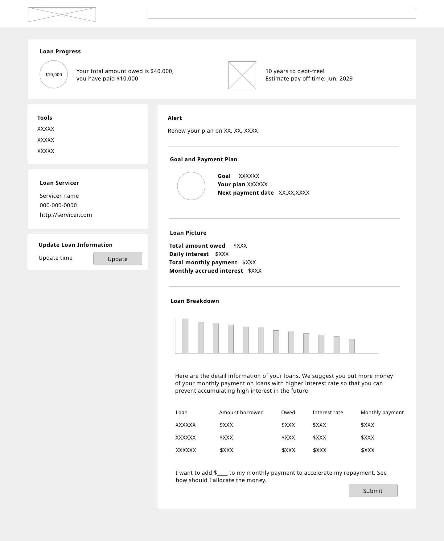
1st Design: A dashboard with essential loan information
User feedback
In the user tests, our users could understand the information on the dashboard. However, they felt the dashboard was similar to what they can see on their loan servicers’ platform and didn’t provide extra values. Besides, some users felt loan servicer cards were overwhelming.
Design perspective
When trying to put the components to a phone size screen, I noticed that the Tasks and Alert section couldn’t fit any place on the dashboard well, and this section interrupt users reading through the information on the dashboard. Also, it could be more time-consuming to develop.
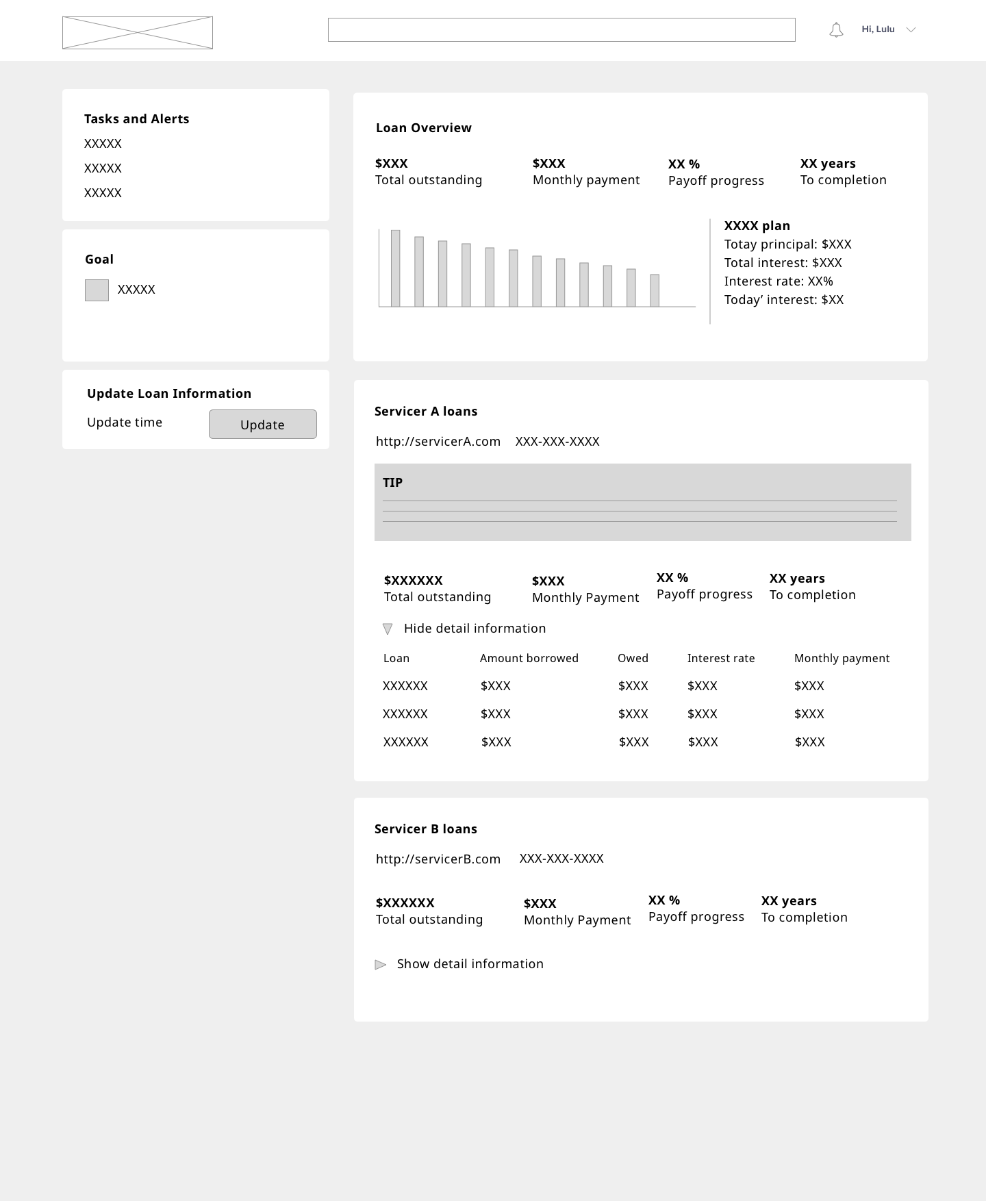
2nd Design: Adding values and improving responsive design
Design Decisions for V2
1. Make the entire page for loan
information only
2. Solve the responsive design
issue
3. Let notifications always be
visible, no matter which page users are on
What inspires me to design the Monthly Overview section?
When thinking about bring more value to our users, I
kept thinking about one of LoanSense's mission:
enhance people's financial literacy. It reminded me that
neither our previous user test participants nor I
understood how borrowers' monthly payment was used to
their student loans. Therefore, I learned from our PM about its logic and
found the information could be important to influence
the repayment strategy.
User feedback
The users thought the interface was neat and liked to see their loan information was broken down into different scope, from plan, overview, monthly overview to details. Although the users like the idea of the monthly overview, some had trouble understanding the Monthly Payment section.
Design perspective
During user tests, I noticed different reading habits and preferences of information influenced the order of how users read. Therefore, my goal for the next version design was to find a better way to guide users to read the information.
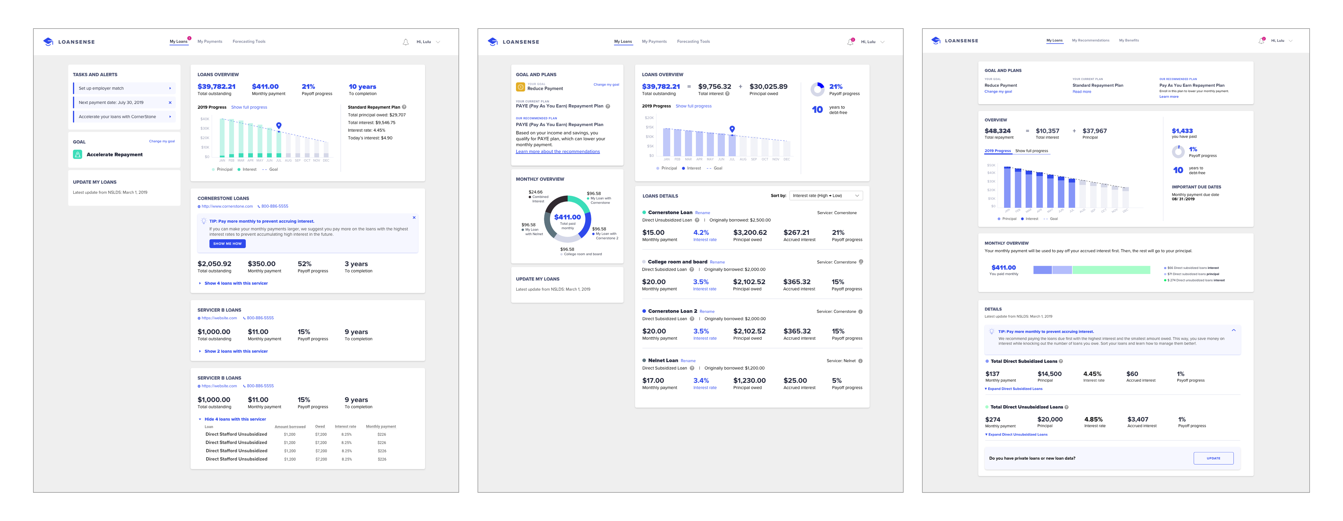
3rd Design: Better way to walk users through their loan information
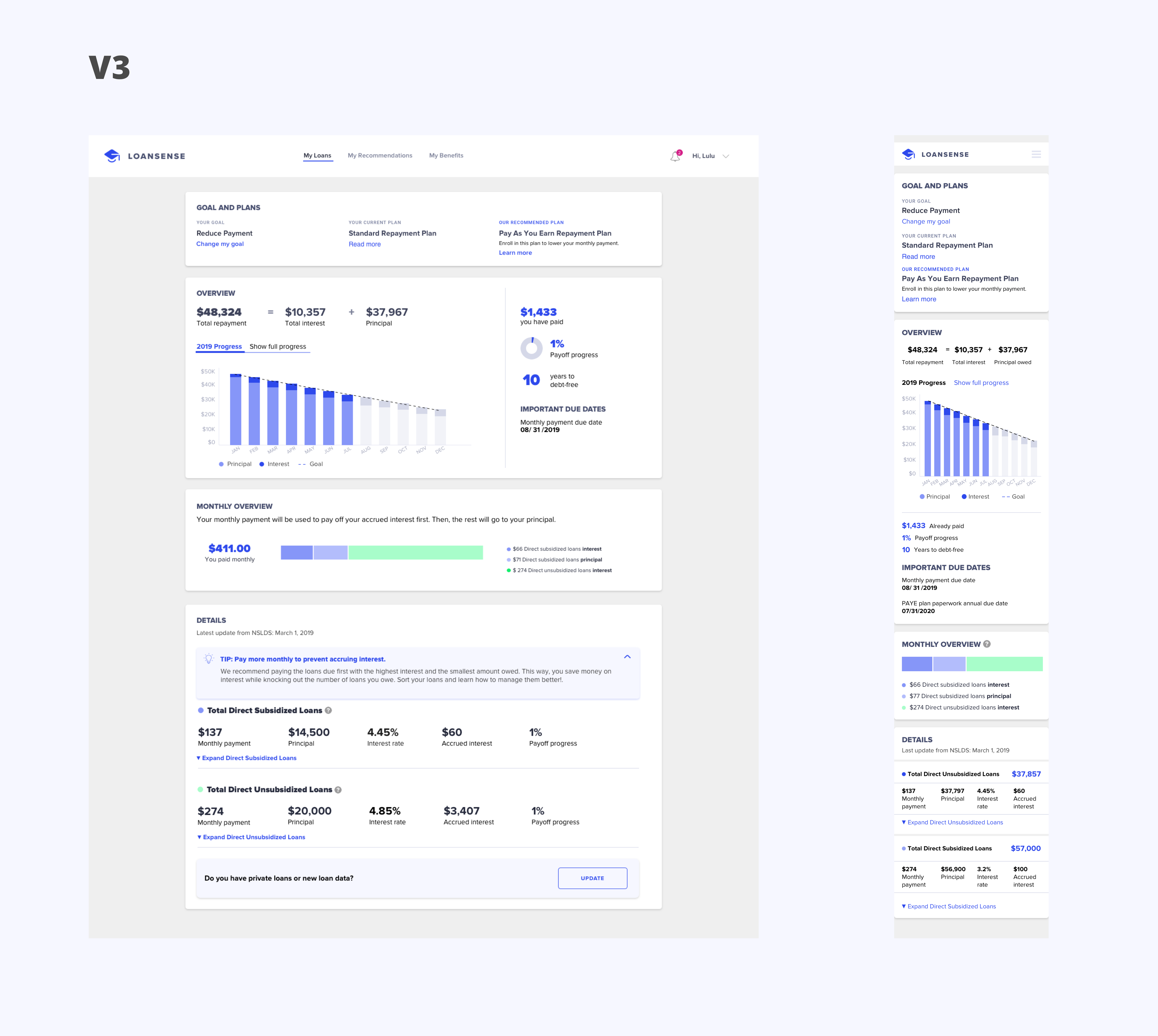
Design Decisions for V3
Turned the two-column design into one-column so that
1. Users can naturally read from top
to bottom and understand information from high level to
low level.
2. It creates a bigger space for
graphs and texts, making the interface not stressing.
3. It will be easier to develop
responsive screens.
User feedback
In this round of user tests, the users were able to explain the information on the dashboard and took less time, compared with the second round of user tests with different participants. Users all felt the interface was clean and informative but not overwhelming. When a user was a little confused about the Monthly Overview section, he knew that he could find answers in the Details section below.
Design Perspective
After reviewing the positive feedback and making sure all of our participants could understand the information in less time, I knew the version was ready to ship to the engineer team. When it's live, we can receive more feedback and keep iterating.
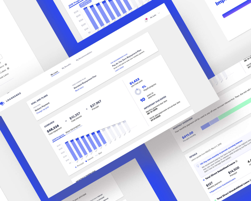
FINAL DESIGN
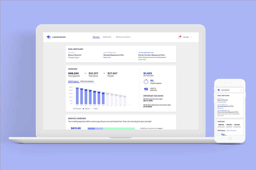
My Loans - Student loan dashboard
My Loans is a student loan dashboard that contains all the student loan information. It presents the numbers and information that LoanSense thinks student loan borrowers need to know based on our expertise in student loans. Furthermore, the dashboard breaks information down to different scopes.
A two-step process to import loans
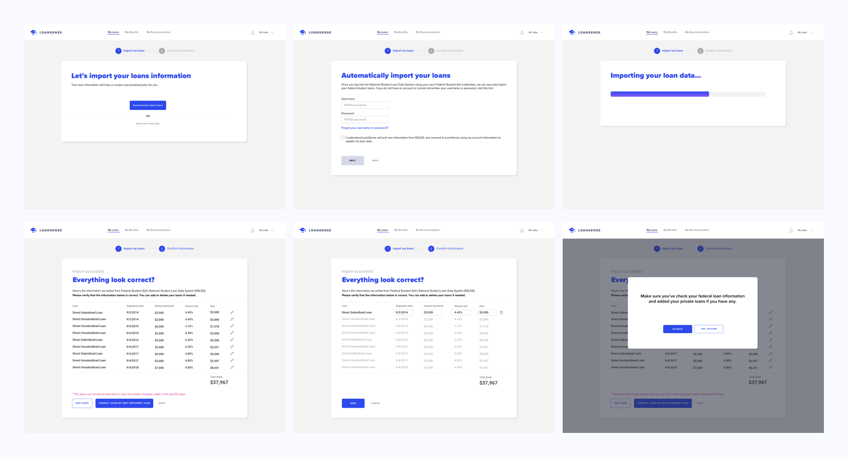
It only takes two steps to import student loan information to the LoanSense system. Users can choose to either link to your FAFSA account or manually input information. Once all information is the system, check again to make sure it's up-to-date, and then they will see their student loan dashboard and personalized recommendation.
A big picture of student loan repayment
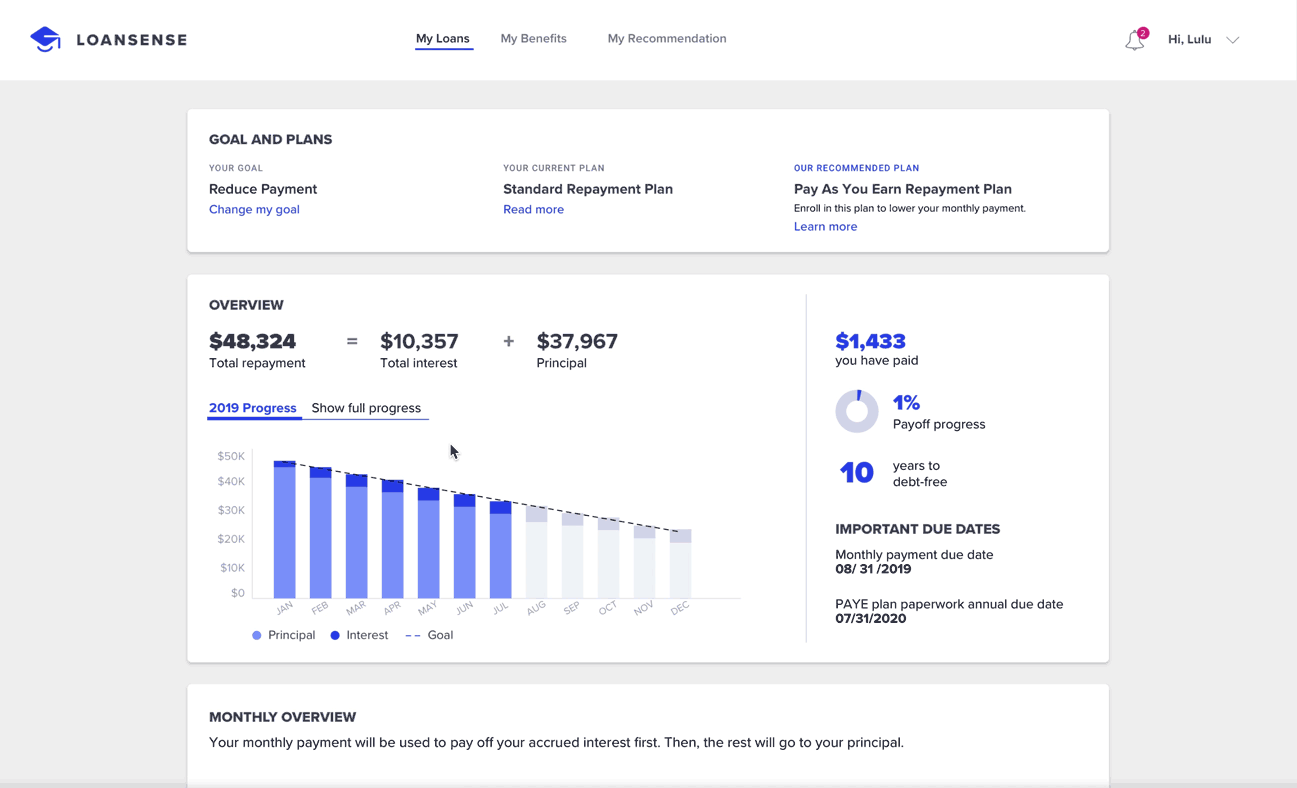
The Overview section provides a summary of the loan plan and repayment progress. With the visualization of users’ payments monthly and annually, they can make your financial plan beforehand for future investments or payments.
Detail loan information
It’s common to have more than one student loan. The Details section categorizes the loans based on the types to help users set up loan pay off strategy according to their needs and goals. Users can browse individual loan information one by one within each loan group, and sort the loans by different parameters.
Explanation and Payment Tips
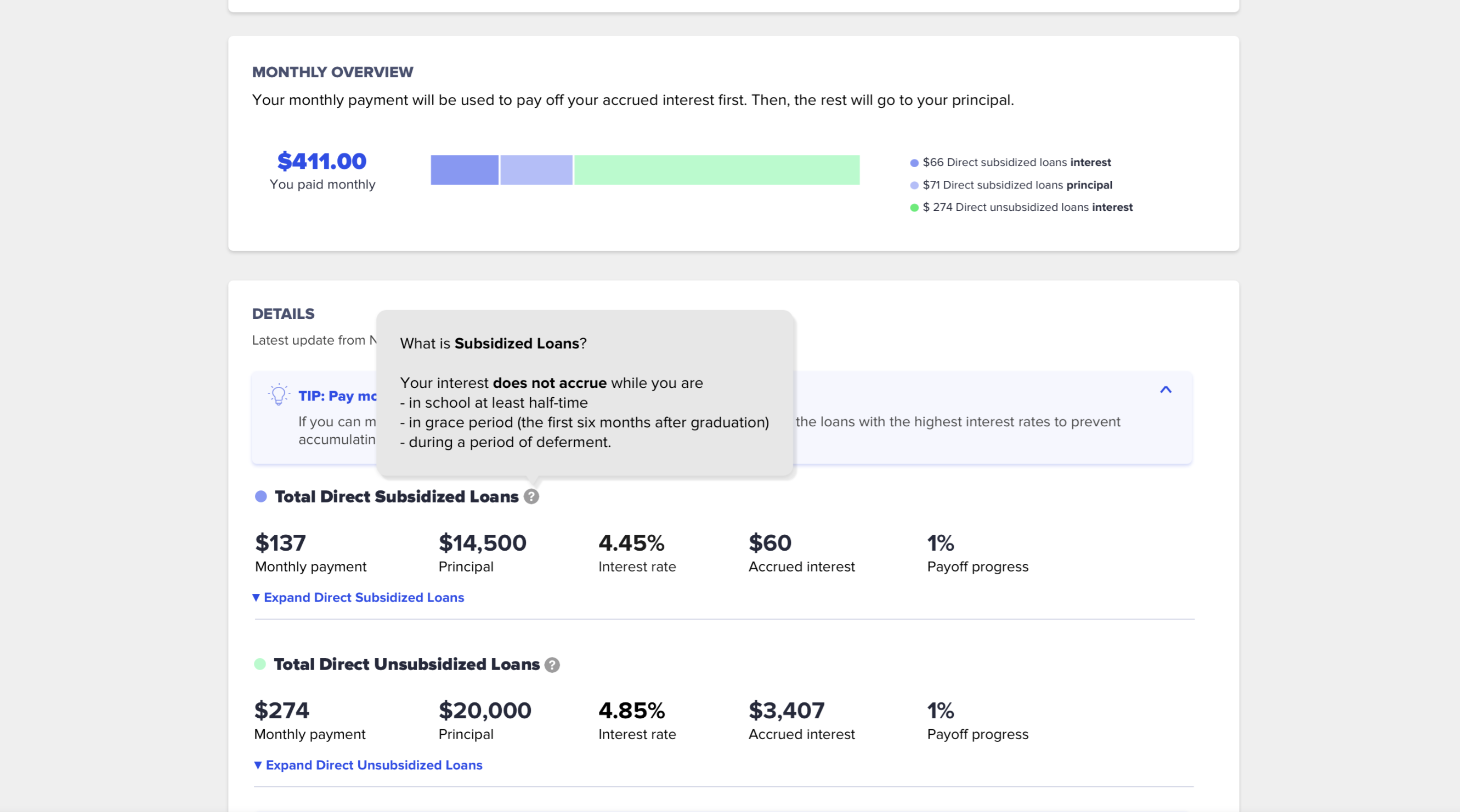
Paying every month but don’t know how your money influences your repayment?
The Monthly Overview section explains how the monthly
payment is allocated to the interest and principal in
each loan group.
Unfamiliar with loan terminology and feel clueless about how to be loan-free faster?
According to users' loan information and personal background, the dashboard shows personalized tips for paying off loans. On the dashboard, the users can also learn the complicated loan terms in the tooltips.
Reflection
What I've learned
Design requires inputs from different roles on a team
The most valuable part of the internship is the experience of working with different roles in a company. Different from student projects, I learned that product design doesn't merely depend on designers. When creating a good user experience, I should also take product strategy, business strategy and feasibility of development into consideration.
Prioritize tasks with limited resources and time
In 14 weeks, I helped design an entire product. In the limited time, I understood the importance of prioritizing tasks. In addition to putting many features on the v1 product, we should evaluate the software development time and the product management after the product launched. To have long-term product development, we should first come up with the key features, and gradually design other plus-on functions in the following versions of product.
Be a quick learner and foresee different user scenarios
The student loan space is really complex. But in the few weeks, as learning more through researching and talking with the PM, I was able to ask different constraints and user scenarios when designing the interface and user flow. It makes LoanSense more dynamic to different user cases.